 |
1. PRIMARY COLOURS These should not be confused with primary colours of light (red, green & blue) or those used for printing (cyan, magenta & yellow). |
 |
2. SECONDARY COLOURS These are the colours which result from mixing the primary colours in equal proportions. 50% red + 50% yellow gives orange. 50% yellow + 50% blue gives green. 50% blue + 50% red gives purple. |
 |
3. TERTIARY COLOURS These colours are those lying halfway between the primaries and the secondaries: 50% red + 50% orange gives red/orange, etc. It is customary to show the colours in a circle or wheel, which was first described by Isaac Newton. |
 |
4. COMPLEMENTARY COLOURS Complementary colours are those which lie opposite each other on the wheel - red and green, for example. These colours produce the highest contrast when placed together. |
 |
5. HUE The hue of a colour is an indication of whereabouts it lies on the wheel, i.e. which part of the spectrum the colour occupies. |
 |
6. INTENSITY Intensity refers to how bright or vivid the hue is. Left is a colour wheel with zero intensity values at the centre changing to full intensity at the outer edge. Mixing a colour with a shade of grey of similar brightness will produce these more muted colours, called tones. Intensity of colours is often called saturation. |
 |
7. VALUE The value of a hue, is a measure of how light or dark the colour is. Colours mixed with white are called tints and have a higher value than shades - colours mixed with black. The colour wheel left shows different values, starting in the centre with off white, and finishing at the outer edge with near-black shades. |
 |
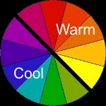
8. TEMPERATURE The colour wheel is often divided into two halves - warm and cool colours. Warm colours are reds, oranges, and yellows, whilst greens, blues and purples are defined as cool or cold colours. |
 |
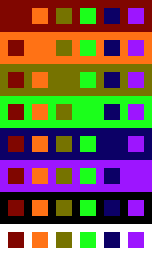
9. CONTEXT The appearance of a colour is very much dependent upon its context. The surrounding colours have a great effect upon how the brain perceives a given colour. The image on the left is composed of only eight colours, but notice how the green square appears to almost shimmer against the red background on the top line. A similar effect may be noticed for each pair of complementary colours. All the colours appear slightly darker viewed against the white background, and lighter against the black. Conversely, the orange squares appear to almost blend in against the red and yellow backgrounds. So we finally come to something we can use to help select colours to create accents on a miniature or building. The greatest contrast will be produced by using a hue in a complementary colour to its surroundings. Green gems will stand out most against a red back ground, for example. In addition, using colours which have similar hues will produce a more harmonious appearance - choosing one third or less of the colour wheel, and limiting your palette to those hues will give far more subtle results than selecting colours from just anywhere. |
 |
10. RELATIVE VALUES Another way to produce contrasts, is to use a light colour against a darker one. The image on the left uses exactly the same hues as the previous one. The red, yellow and blue have been darkened to about half their previous value, whereas the other three colours have been lightened very slightly. In terms of paint, I have added black to the red yellow and blue, and a little white to the secondary colours. Notice how the contrast between the different colours has changed quite dramatically. The red and orange appear far more distinct against each other, as do the blue and green. Notice also that the yellow takes on a sort of dirty green/brown appearance. This effect happens with paints too, and a "dark yellow" colour is usually achieved by adding a little red or orange, rather than black. A near opposite effect happens when a red colour is tinted - we even give the resulting light red colour a different name: "pink". In this case, the usual trick is to add a little yellow to the colour, rather than white. |
 |
11. RELATIVE INTENSITY This image contains 14 colours. The background colours have been reduced in intensity, whilst the foreground squares remain at full saturation, i.e. exactly the same colours as used in figure 9. Notice how the foreground colours appear to be less vivid, although they are the exact same ones used in image 9. Rather than giving high contrasts, the use of a less intense colour palette will produce a far more subtle appearance. |


